MAKE A MEME
View Large Image

| View Original: | Dumbbells_with_same_color_as_the_weight_numberings_inconvenience_customers.jpg (1200x1600) | |||
| Download: | Original | Medium | Small | Thumb |
| Courtesy of: | www.flickr.com | More Like This | ||
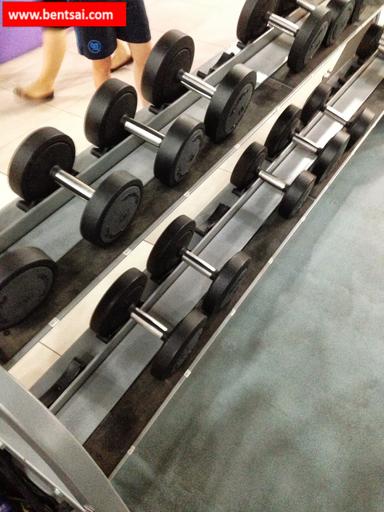
| Keywords: #Singapore., #FitnessFirstSingapore., It is difficult to view what are the weights of the respective dumbbells due to the poor color contrast of the weight indicator on the dumbbell. Black weight indicators does not contrast well with black dumbbells. This creates poor readability. Even though there are weight labels on the shelves; most users do not return the dumbbell to the right compartment on the shelf. The dumbbells are declined 30 degrees downwards to the ground. The photo above is taken at the vantage point where most users would be standing, the user need to 1. bend down to find the ('hard to read') correct dumbbell weight 2. duck walk left and right for an extended time period to locate the weight as it is hard to read the weight indicator off the dumbbell. This problem leads to time wastage of gym members who are elite workers and bosses of society (they can afford the membership fees). Where time savings can be translated into other higher valued tasks such as work to earn more money or play (spend time with mistresses). How could gym competitors learn from this and improve their facilities to enhance positive customer experience With improved facility by the competitor: > the competitor would get a good recommendation by existing gym members to their friends > more new clients would join the competitor > increased sales to competitor > reduced profits to current management retail melbourne australia | ||||