MAKE A MEME
View Large Image

| View Original: | Efficient_placement_of_Iphone_-_Write_New_SMS_message_button_with_Messages_button_2.png (438x512) | |||
| Download: | Original | Medium | Small | Thumb |
| Courtesy of: | www.flickr.com | More Like This | ||
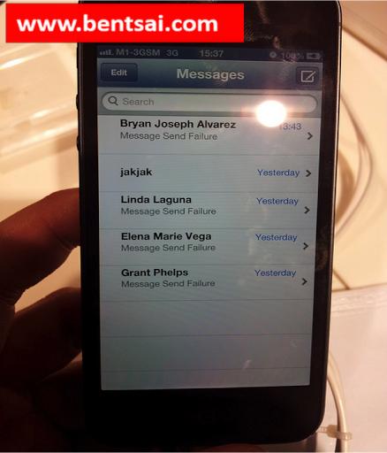
| Keywords: #Apple., Imagine i need to to compose a SMS to a contact, (i am a right hander) I would need to move my thumb from the right side of the screen across to the left side of the screen to activate the ‘SMS’ app and move my thumb back to the right side of the screen to activate ‘Compose new SMS’ button. Is that well designed? Is that ergonomic? Answer: That is a lot of effort. Would it be more efficient to place the "Messages" button (Photo A) on the right hand corner of the home screen; as the "Write new SMS message" button (Photo B) is on the right hand corner of the app? Answer: Yes. Would this reduce the amount of time, energy and effort required to traverse from one command execution to the next? Answer: Yes. Yes, you can move the SMS app icon around, but the above placement is the default layout for the #Iphone launch. How many silent customer noticed it and got a bad impression of #Apple., ? Answer: At least one customer. Me! Lost of $1000 worth of sales into #Apple.'s management bonus. When was the last time someone rejected or reduced their bonus voluntarily? Answer: I do not know of anyone that does that. How does that align with #Apple's values of being a pioneer in technological design? Answer: It doesn't. retail melbourne australia | ||||