MAKE A MEME
View Large Image
| View Original: | Typographic_monstrosities.png (3266x2188) | |||
| Download: | Original | Medium | Small | Thumb |
| Courtesy of: | commons.wikimedia.org | More Like This | ||
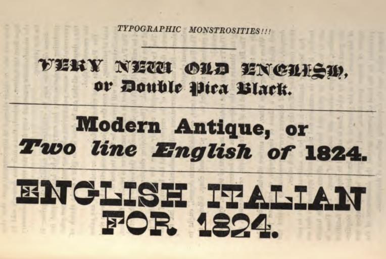
| Keywords: Typographic monstrosities.png en In 1825 Thomas Curson Hansard expressed amusement at the increasing use of eye-catchingly bold type for printing advertisements in Britain Let's take a look at what he found absurd blackletter type I'm not sure why he didn't like this although the historical authenticity is probably rather doubtful and it's certainly very bold slab serif type with a monoline structure and 'Italian' or reverse-contrast type 1825-01-01 Typographia 1825 digitisation via the Internet Archive Thomas Curson Hansard other versions PD-old-70-1923 Typography of the 1820s Uploaded with UploadWizard | ||||